 Creating a developer list page with a wwWebDataGrid
So now let's do something a little bit more useful. Let's use the data from the Developer Registry Sample walk through and present it as a list. Then we'll drill into the data, display it for editing and saving for a simple application.
Let's create a new page and call it DeveloperList.wcsx. The process is going to be very much the same as the last sample. To review:
- Create a new page in Vs.net and call it DeveloperList.wcsx
- Go into Source View and drag and drop a wwWebPage after the ASP.NET directive
- Set the ID to customerlist_page and the GeneratedSourceFile to DevDemo\developerList_page.prg
- Add a header Developer List and Change the Title to Developer List
- Set the header text to Heading 1 style
- Add a link back to the Home Page
- Drag and drop the WestWind.css stylesheet onto the page
- Write a caption into the page content: Enter Developer Name
- Add a TextBox - txtName
- Add button next to it and call it btnSubmit
- Add a label below the textbox and call it lblMessage and add a line break after it
Up this point everything's pretty much just like before. So let's have some fun here...
Go over and drag and drop a wwWebDataGrid underneath the Message Label. Your page should now look like this:
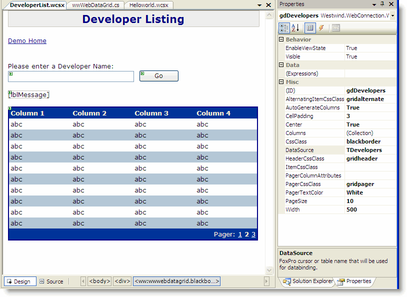
Actually I jumped ahead a little bit here - I set a number of properties on the wwWebDataGrid. Specifically I applied various styles from westwind.css, set AutoGenerateColumns to true and set the data source to TDevelopers. The DataSource is a cursor that we'll read from.
Just to get an idea from those setting the wwWebDataGrid ASPX tag looks like this:
<ww:wwWebDataGrid ID="gdDevelopers" runat="server" AutoGenerateColumns="True"
                  CssClass="blackborder" DataSource="TDevelopers" PageSize="10"
                  AlternatingItemCssClass="gridalternate" HeaderCssClass="gridheader"
                  PagerCssClass="gridpager" PagerTextColor="White">
</ww:wwWebDataGrid>
So now there's one thing left to do - trigger the code to give us this TDevelopers datasource to bind to. We want to hook up the Click event to the btnSubmit_Click method on the FoxPro class. To do this we'll add a click event to the btnSubmit button:
<ww:wwWebButton ID="btnSubmit" runat="server" Text="Go" Width="80" Click="btnSubmit_Click" />
Note for VS.NET Event Hookup:
Events that fire back to FoxPro must be hooked up in the source view and not through the VS.NET IDE. This is because VS.NET adds code to the page and often uses different event names (turning click into OnClick etc.). It's better to explicitly enter the event handler here.
Once the Click event is hooked up head back to VFP to hook up the code to this event.
Back in FoxPro
Go back to FoxPro. You know the drill right? Open DeveloperList_page.prg... Oh wait! No page, huh? We haven't generated yet. To generate the page we can simply run it with DebugMode on (which triggers the page compiler), or we can use the page compiler directly. Let's do that so you can see how it works by running the WebPageParser.prg class from VFP. Type:
DO WebPageParser with "\DevDemo\DeveloperList.wcsx"
This should now parse the page and show you a new source file for DeveloperList_page.prg. At the top of the listing there should be a mostly an empty class called DeveloperList_page. This class is where we're going to hook up our code, with the generated class below it.
I'm going to use the wwDevRegistry business object to do the data access and feed me this cursor. I'll create a btnSubmit_Click event handler method and implement the code to get the data and then databind it to the DataGrid. Sounds all very complicated - but it's not. Here's what the class looks like after all of this:
* *** *** *** *** *** *** *** *** *** *** *** *** *** *** *** *** *** *** *** ****
DEFINE CLASS DeveloperList_Page as WWC_WEBPAGE
* *** *** *** *** *** *** *** *** *** *** *** *** *** *** ***

oDeveloper = null

FUNCTION OnLoad()

* ** Create instance of business object
this.oDeveloper = NEWOBJECT("wwDevRegistry","wwDevRegistry.vcx")

ENDFUNC


FUNCTION btnSubmit_Click()

* ** Retrieve a list of developers which returns a few fields into TDevelopers
lnCount = this.oDeveloper.DeveloperListQuery(this.txtCompany.Text)
IF lnCount = 0
   THIS.SetError("No records returned.")
   RETURN
ENDIF

* ** Force auto-column creation
this.gdDevelopers.DataBind()

ENDFUNC

* ** Quick Error Display function
FUNCTION SetError(lcMessage)
this.lblMessage.Text = lcMessage
this.lblMessage.ForeColor = "red"
ENDFUNC

ENDDEFINE
Go ahead and run the page now and you should see a result like this:
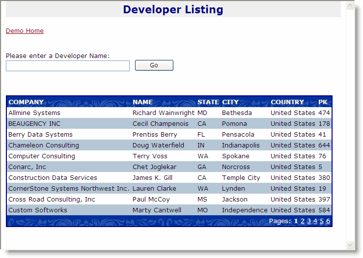
It works! In the screen shot I passed no parameters so I get a list back of all customers. Because I set the PageSize to 10 I only see the first 10 items. If you put a filter into the Company field you'll see that that works as well, returning only a couple of items.
But, there's a problem with this DataGrid display if you're displaying a long list that requires multiple pages, isn't there? If you click on one of the Page buttons, the DataGrid disappears, rather than going to the specified page. Can you see why?
It's because we're updating the datagrid on the button click, but when we change pages we're not clicking on the button and the DataGrid never gets databound. Remember we're still dealing with a stateless Web application, so there's no physical grid anywhere - we're drawing the grid by way of the Databinding we apply, and we're only doing it in the button click event - it doesn't happen on all code paths. That's not what we want - we want the grid to ALWAYS display.
The best way to do this is to do the grid rendering after all our page code has run. First OnLoad() fires then any events fire, then OnPreRender() fires and finally the page is rendered. We can implement the OnPreRender() method to write code that occurs just before rendering and that's why it's a good hook point to put our grid formatting and Databinding.
So let's change the code to this:
* *** *** *** *** *** *** *** *** *** *** *** *** *** *** *** *** *** *** *** ****
DEFINE CLASS DeveloperList_Page as WWC_WEBPAGE
* *** *** *** *** *** *** *** *** *** *** *** *** **
* ** Your Implementation Page Class - put your code here
* ** This class acts as base class to the generated page below
* *** *** *** *** *** *** *** *** *** *** *** *** *** *** *** *** *** *** *** ****

oDeveloper = null

FUNCTION OnLoad()

this.oDeveloper = NEWOBJECT("wwDevRegistry","wwDevRegistry.vcx")

ENDFUNC


FUNCTION btnSubmit_Click(loCtl)

* ** Force the first page to be displayed on a new query
* ** If we don't do this the Page index stays at the previous selection
this.gdDevelopers.CurrentPageIndex = 1

ENDFUNC


FUNCTION OnPreRender()

lnCount = this.oDeveloper.DeveloperListQuery(this.txtCompany.Text)
IF lnCount = 0
   THIS.SetError("No records returned.")
   RETURN
ENDIF

* ** Force auto-column creation
this.gdDevelopers.DataBind()

ENDFUNC

FUNCTION SetError(lcMessage)
this.lblMessage.Text = lcMessage
this.lblMessage.ForeColor = "red"
ENDFUNC

ENDDEFINE
Notice that I merely removed the code from the Click event and moved it to OnPreRender(). Instead I put in a setting the resets the page of the grid back to page 1, because as we run a new query we want to make sure we see page 1 not the last selected page. By moving the code into OnPreRender() we're now firing the grid setup on EVERY page hit and our event handling merely sets a few properties to determine just how the grid is to render.
Now if you run the form, the data list will properly handle the paging and stay displayed on the page. You don't need to do anything else to get the paging to work. Another side benefit of this feature is that the page immediately displays the list of customers on entry, without forcing a click on thte Go button.
A common Page Pattern
Using a Web Page framework this is a common pattern: In order to maintain state you need to draw controls that show over multiple POSTbacks from a central method that always fires. Typically this will be OnPreRender(), but it can also be OnLoad() if you don't modify the control in events. Any code you fire in an event will only be called when you indeed cause that event to happen. In most cases you'll want to use events to set properties that are used later on in the final display rendering code - in the example above it turns out we don't need the Click event handler to do anything - we could have left it out - because our state for the grid routine comes from the txtCompany TextBox.
We'll see more examples of this as we move forward, but it's an important concept to get familiar with now. It's a typical state machine concept that's used, where your specific page code deals with setting properties and values on controls or objects, with a central state manager/display routine that is then responsible for handling how the page controls display. It's a lot more like Windows Desktop development than Web development, but modified to support the stateless metaphor where everything needs to always redraw.
Customizing the Grid display
At this point we have a grid with the fields we specified but it doesn't look all that great. For one thing we have fields in there that we may not need (Pk) and we may want to change the layout of the various columns. So, let's start by isolating our display routine for the grid into a separate method called ShowGrid. Then I'll go in and remove the PK column and add some basic formatting to a couple of the columns. Here's what the code looks like now:
FUNCTION btnSubmit_Click(loCtl)

* ** Force the first page to be displayed on a new query
this.gdDevelopers.CurrentPageIndex = 1

ENDFUNC


FUNCTION OnPreRender()

THIS.ShowDataGrid()

ENDFUNC


FUNCTION ShowDataGrid

lnCount = this.oDeveloper.DeveloperListQuery(this.txtCompany.Text)
IF lnCount = 0
   THIS.SetError("No records returned.")
   RETURN
ENDIF

* ** Auto-gen columns from cursor fields
this.gdDevelopers.AutogenerateColumns = .T.

* ** Force auto-column creation
this.gdDevelopers.DataBind()

* ** Auto-generated Column names are lower case
this.gdDevelopers.Columns.Remove("pk")

* ** Change the alignment of the State column
LOCAL loCol as wwWebDataGridColumn
loCol = this.gdDevelopers.Columns.Item("state")
loCol.HeaderAttributeString = [style='text-align:center']
loCol.ItemAttributeString = [style='text-align:center;color:darkred;font-weight:bold']

* ** Assign a format string
loCol.Format = "@!"

* ** Or you can use an expression -
* ** expression must accept 1 parameter and return a string
* loCol.Format = "=Upper"

* ** Give Company field some breathing room
loCol = this.gdDevelopers.Columns.Item("company")
loCol.ItemAttributeString = [style="width:250px"]
ENDFUNC
All the action is now in ShowGrid, which calls DataBind() to auto-generate the columns. Once DataBind has been called you can then access the auto-created columns and work with them. The first thing you can do with auto-generated columns is drop those you don't need as I'm doing with the PK here. Then I take the state column and apply style formatting via the Header and ItemAttributeString properties. These properties take any value that gets added onto the TD tag for the header and item display cell specifically. Each cell for that column gets these tags. Using CSS style tags gives you the most flexibility and I recommend that you use them liberally for this task.
Format Expressions
Note also the Format Expression - you can assign any VFP format expression to the grid column. Alternately you can use a function or method expression if you proceed the expression with an = sign. When you use the = sign Web Connection will run the specified method and pass the raw data value as parameter. The function must return a string.
Our display now looks like this:
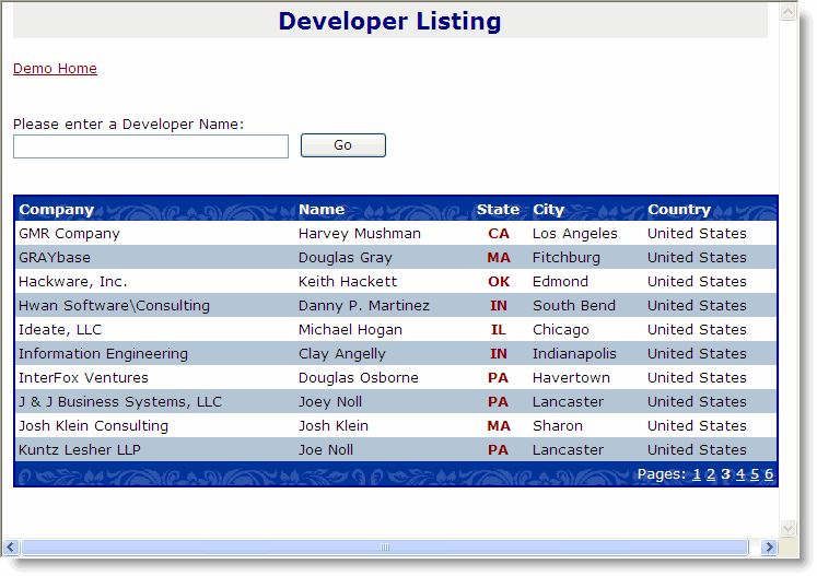
Notice the PK field is missing, the State field shows in red and is centered and the Name field has a little breathing space.
Manipulating Field Expressions and Adding New Columns
In the example above I added columns automatically because the AutoGenerateColumns flag is set to .T. But you can also create a grid entirely with code (or script markup as I'll show later). DataGrid columns are bound to field values via their Expression property.
Let's start by adding an Edit column to the datagrid. Here's how to do that in the ShowGrid method:
loCol = CREATEOBJECT("wwWebDataGridColumn")
loCol.HeaderText = "Action"
loCol.Expression = ['<a href="EditDeveloper.wcsx?id=' + TRANSFORM(pk) + '">Edit</a>']
loCol.HeaderAttributeString = [align='center']
loCol.ItemAttributeString = [align='center']

this.gdDevelopers.Columns.Add("edit",loCol)
Notice the Expression field which conains an expression that is evaluated as each row is scanned in the datagrid. Make sure you embed an expression for any values like the PK, not the actual value - IOW, don't do this:
loCol.Expression = ['<a href="EditDeveloper.wcsx?id=] + TRANSFORM(pk) + [">Edit</a>']
This line of code results in all values being set with the same exact Pk because this in effect hardcodes the PK into the expression. If this seems difficult to see the difference try it out and play around with the expression string.
Cool! What you're seeing here is that we have A LOT of control over this new column and how it displays. We can do this with existing columns as well as new ones.
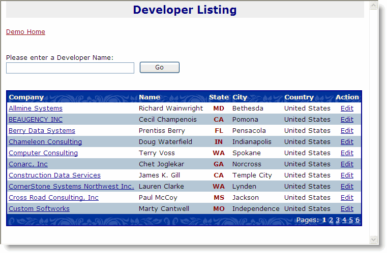
Let's add one more thing to our sample here to segue into the next step. Let's create a hyperlink on the Company to allows to view a developer entry. To do so add this code on the bottom of ShowGrid():
* ** Add a hyperlink to drill down into company
loCol = this.gdDevelopers.Columns.Item("company")
loCol.Expression = ['<a href="ShowDeveloper.wcsx?id=' + TRANSFORM(pk) + '">' +TRIM(Company) + '</a>']
Our grid now looks like this:
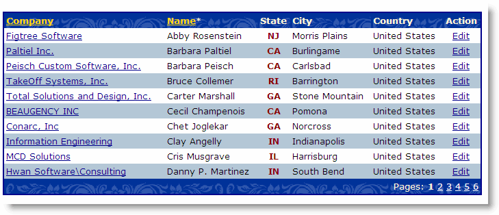
Adding Sorting
A final excercise for you with might be to add sorting to the grid. Let's say we want to allow sorting by Company and by Name.
* ** Add a hyperlink to drill down into company
loCol = this.gdDevelopers.Columns.Item("company")
loCol.Id="company"
loCol.Expression = ['<a href="ShowDeveloper.wcsx?id=' + TRANSFORM(pk) + '">' +TRIM(Company) + '</a>']
loCol.Sortable = .t.
loCol.SortExpression = "upper(company)"

* ** Make the Name column sortable
loCol = this.gdDevelopers.Columns.Item("name")
loCol.Sortable = .t.
Sorting makes the column headers clickable as links and shows a * next to the sorted column to indicate that it's the sort key.
The final result of sorting applied looks like this:
Note on Sorting and Expressions:
Sorting is based on SortExpressions that are applied by running another query against the cursor specified in the datasource. It does a SELECT * and adds the sort expression, then uses ORDER BY on it. This has two issues: There's some additional overhead as a new cursor is created. It also means that the cursor used for expressions changes. As a result it's highly recommended that your column field expressions are not using Cursor.Field syntax, but just the Field name for any references to data source fields.
Grid Color Formatting
You'll notice that this grid looks reasonably nice as is without having to do any special formatting. The formatting is controlled via the Westwind.css stylesheet that is attached to this page. Westwind.css contains many commonly used styles like GridHeader, GridNormal, GridAlternate etc. that are used as defaults in the grid. You can change the way this CSS stylesheet looks or simply copy those styles to another stylesheet.
You can also use your own styles of course - nothing is hard coded, but the defaults use the styles provided in westwind.css. A few things are crucial in these styles, specifically the link color style used for A tags inside of headers, which wouldn't show properly without special style attributes.
For example the following tag is set up for the gridheader tag to ensure that links show with a compatible color:
.gridheader A, gridheader A:visited
{ color: gold; }
Without this formatting links would be lost with some low res color contrast.
In general we recommend that you provide the stock styles provided in westwind.css - it's a solid staring point for common styles and you can build ontop of that list with application specific styles as needed.
Using VS.NET for adding columns declaratively
In the example here I started with Auto-generated columns because we actually wanted to display most of the columns of the returned cursor. Here it was easier to autogenerate and then modify the existing columns with the two or three property changes needed to be made.
You can also create columns declaritively inside of VS.NET. You can use the Columns collection in the designer. Click on the Columns collection and start adding columns declaratively:
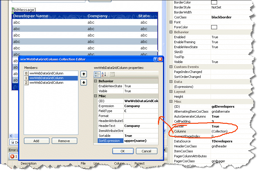
Using this in the VS.NET IDE gives you a reasonably close approximation as to what the data grid will look like when rendered. Realize that it's not exact, as the .NET code rendering is only minmal and abstract and basically duplicates what the Fox control does behind the scenes.
Note that you don't need VS.NET to create this user interface. You can use any text editor and create the markup manually which looks like this:
<ww:wwWebDataGrid ID="gdDevelopers" runat="server" AutoGenerateColumns="false" CssClass="blackborder"
    DataSource="TDevelopers" PageSize="10" AlternatingItemCssClass="gridalternate"
    HeaderCssClass="gridheader" PagerCssClass="gridpager" PagerTextColor="White"
    Width="500">
< Columns >
    <ww:wwWebDataGridColumn ID="WwWebDataGridColumn1" runat="server" Expression="Name"
        FieldType="C" HeaderText="Developer Name" />
    <ww:wwWebDataGridColumn ID="WwWebDataGridColumn2" runat="server" Expression="Company"
        FieldType="C" HeaderText="Company" Sortable="True" SortExpression="upper(name)" />
    <ww:wwWebDataGridColumn ID="WwWebDataGridColumn3" runat="server" Expression="state"
        FieldType="C" HeaderText="State" Sortable="True" HeaderAttributeString="align='center'"
        ItemAttributeString="align='center'" SortExpression="" />
< /Columns >
</ww:wwWebDataGrid>
Note that you'll want to turn AutoGenerateColumns to false if you use custom columns.
Onwards
Phew... long topic, but we covered a lot of options here. The next step is to allow drilling into the Developers and display the data with DataBinding.

Comment or report problem with topic