 Class wwModalDialog
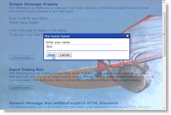
The background can be just an opaque color with a transparency value - the default is black at 70% for example which gives a grey looking overlay - or can be a custom Html element that is expanded and then made transparent as in the following figure.

The control styling is entirely up to you but there are default styles that mimic the look of a dialog box. The control is based on wwDragPanel so the modal popup dialog can be draggable and closable. Events are available to fire when a button or the close button is clicked with event firing either on the client or server. The content of the dialog is just part of the HTML layout and the modal dialog control just makes that content visible or overlays it on top of another page as needed.
The client side counter part class can be used without this server side control and allows a few extra features, such as a mechanism to display a dialog without controls on the page to map to.
System.Object
System.Web.UI.Control
System.Web.UI.WebControls.WebControl
System.Web.UI.WebControls.Panel
Westwind.Web.Controls.wwDragPanel
Westwind.Web.Controls.wwModalDialog
public class wwModalDialog : wwDragPanel
| Member | Description | |
|---|---|---|
 |
Constructor | |
 |
Show | A server side display method that forces the modal dialog to be to be displayed when the page loads. public void Show( string Message, string Title ); public void Show(); public void Show( string Message, |
 |
BackgroundOpacity | The opacity of of the overlay background in a decimal percentage. Default to .85 |
 |
CancelButtonId | Optional ID of a button that is used to cancel an operation. This Id is optional and should be used only if you have a second button. |
 |
ClientID | Override to force simple IDs all around |
 |
ContentId | The client ID of the element that receives the content message. If not specified the message is written to the body of the control. |
 |
FadeinBackground | When true fades in the background by slowly increasing reducing opacity of the background |
 |
HeaderId | ID of a header element that receives the Title when calling showDialog() on the client. Optional - if not specified the header is not set which means the dialog displays as designed. |
 |
OkButtonId | The ID of the button that is used to close the dialog. A button and this ID are required. |
 |
OnClientCloseHandler | |
 |
OnClientDialogClick | Client side event handler that is fired when a button is clicked to close the dialog. The handler receives two parameters: 1 or 0 for Ok or Cancel respectively, and the object that fired the event which is the button. This allows you to retrieve the caption. |
 |
OverlayId | Optional Id that is to be used for the shaded Overlay. This allows you to create a colored or otherwise designed background that pops over the existing content. |
 |
ScriptLocation | Determines the location of thte JavaScript support file if ScriptLocationType is set to ExternalFile |
 |
UniqueID | Override to force simple IDs all around |
 |
zIndex | The zIndex value for the overlay and dialog. This value must be higher than any other control on the page in order for the dialog to pop up on top. |