 Using the TabControl for multi-page Display
The TabControl provides a simplem client controlled tab interface to display multiple pages with a tabbed interface at the top. The control renders only the 'tabstrip' and handles client side tab button clicks to activate the appropriate page selected by making all others but the selected page invisible.
Content pages are simply created as plain <div> tags with an ID that is referenced via the TabPageClientId property in each of the TabPage child controls that are added to TabControl. A default SelectedTab can be chosen which is displayed initially and the control keeps track of the tabpage active across postbacks.
The tab control only fires on the client and there are no server side events fired. You can assign the SelectedTab property but otherwise the server side has no additional control. Client side code can activate the tab with a JavaScript ActivateTab(tabId, num) which specifies the ClientID of the tab control and the tab by number or client ID of the Div.
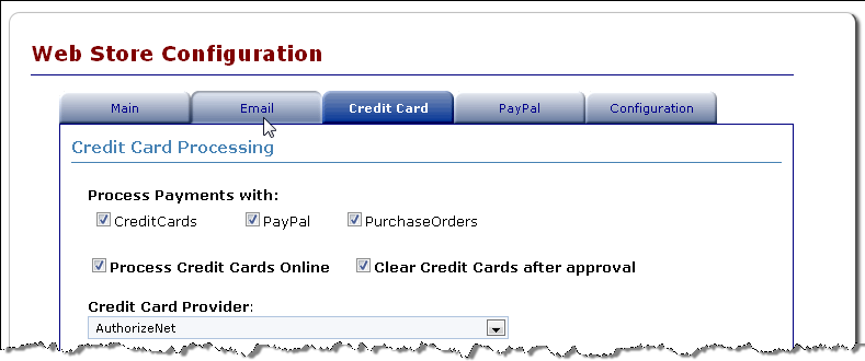
Basic Example
The following is a very basic example that demonstrates how the tab control and the pages are set up:
<div class="containercontent">

    <ww:TabControl runat="server" ID="TabControls" TabHeight="25" TabWidth="120"
        TabstripSeparatorHeight="" >
        <TabPages>
            <ww:TabPage runat="server" ID="Page1" TabPageClientId="Page1" Caption="Page 1"
                Style="height:25px;width:120px;height:25px;width:120px;" />
            <ww:TabPage runat="server" ID="Page2" TabPageClientId="Page2" Caption="Page 2"
                Style="height:25px;width:120px;height:25px;width:120px;" />
            <ww:TabPage runat="server" ID="Page3" TabPageClientId="Page3" Caption="Page 3"
                Style="height:25px;width:120px;height:25px;width:120px;"/>

        </TabPages>
    </ww:TabControl>

    <div id="Page1" class="tabpage">
        Page 1
    </div>
    <div id="Page2" class="tabpage">
        Page 2
    </div>
    <div id="Page3" class="tabpage">
        Page 3
    </div>
</div>
Tab Styling
The tab display formatting is controlled via CSS style classes that are rendered into the content.The following classes are used in styling the tab strip (found in westwind.css):
.tabbutton, .selectedtabbutton
{
border-style: none;
border-color: inherit;
border-width: 0px;
font-size: 8pt;
background: url('images/tabnormal.gif') no-repeat;
text-align: center;
vertical-align: middle;
cursor: hand;
color: darkblue;
width: 120px;
margin: 0px;
padding:0px;
}
.tabbutton:hover
{
background: url('images/tabhover.gif') no-repeat;
}
.selectedtabbutton
{
font-weight: bold;
color: white;
background:url('images/tabselected.gif') no-repeat;
cursor:default;
}
.tabstripseparator
{
background: navy;
}
Tab Activation on Client and Server
Both client and server can select which tab is to be displayed.On the server (C#):
Tabs.SelectedTab = "Page2"; // Page2 is ClientId of the <div>On the client (JavaScript):
ActivateTab("Tabs",1);  // 0 based tab collection
ActivateTab("Tabs","Page2") // text based ClientID for Tab
See also
Class TabControl | Class TabPage
Comment or report problem with topic