 Namespace Westwind.Web.Controls
This topic tree describes the Westwind.Web.Controls namespace.
| Type | Description |
|---|---|
 BindingError BindingError |
Error object used to return error information during databinding. |
| BindingErrors |
This class provides a holding container for BindingErrors. BindingErrors occur during binding and unbinding of controls and any errors are stored in this collection. This class is used extensively for checking for validation errors and then displaying them with the ToString() or ToHtml() methods. |
| AjaxMethodCallback |
The AjaxMethodCallback control provides an easy mechanism for making page or control level method callbacks from an HTML page. Working with both client side and server side logic you can make remote method calls from the client using two-way JSON serialization to access server side content from client pages. Methods are mapped from server to the client with an optional client proxy class that allows making direct method calls to the server. |
| AutoComplete |
A WebForms wrapper control around the jQuery UI AutoComplete control. This control provides code based AJAX callbacks either to a specified service URL (which allows calls to a CallbackHandler HTTP Handler service for example) or directly to the page using an event based callback to the controls CallbackHandler event. |
| BindingErrorException |
Exception thrown when a BindingError is encountered |
| Captcha |
A Captcha control that uses simple math expressions for validation before accepting input. This control is fully self contained and carries the expected 'result' with it in ControlState data, so unlike image captcha there's no separate handler involved. |
| DataBinder |
The DataBinder class provides two-way, simple databinding a single datasource value and single control property. It can bind object properties and fields and database values (DataRow fields) to a control property such as the Text, Checked or SelectedValue properties. In a nutshell the controls acts as a connector between a datasource and the control and provides explicit databinding for the control. The control supports two-way binding. |
| DataBindingItem |
An individual binding item. A BindingItem maps a source object - a property/field or database field - to a property of a Control object. The object is a child for the DataBinder object which acts as a master object that performs the actual binding of individual BingingItems. Binding Items can be attached to controls and if the control implements the IDataBinder. Note: This class inherits from Component so the designer can properly |
| DataBindingItemCollection |
Collection of individual DataBindingItems. Implemented explicitly as a CollectionBase class rather than using List#DataBindingItems# so that Add can be overridden |
| DataBindingValidationEventArgs |
Event Args passed to a Validate event of a DataBindingItem control. |
| DragPanel |
A draggable Panel control that can be dragged around the current browser window. Dragging is supported for the panel and initiated through a drag handle control - a control that is contained in the window and acts as the draggable hot spot that initiates dragging. You can also make the Panel itself the drag handle. The control can also optionally display a close button that allows hiding the control by changing its client side visibility. |
| ErrorDisplay |
The ErrorDisplay control provides a simple mechanism for displaying error and status messages in an easy to use, attractive and reusable control. The class includes several ways to do display data (ShowError, ShowMessage) as well as direct assignment to the .Text property which allows direct display of content. Assigning to .Text and with a UserMessage set: |
| HelpControl |
This class presents a Help Link on a page. Specify a linkname in the HelpTopic property. Usually this is the name of a page. Note: Can only be dropped on a wwWebForm derived Page class as it depends on methods in this class to figure out base URLs. Note: The image does not display in design mode. |
| HoverPanel |
The HoverPanel class provides an easy to use base AJAX control that allows quick access to server side content from a URL and embed it into the control's content. The control provides various visual customization aspects from shadows, transparency, the ability to drag it around and close it as well as pop up and auto hide. The most prominent feature of this control is to provide auto-popup functionality that shows context sensitive content |
| jQueryDatePicker |
ASP.NET jQuery DatePicker Control Wrapper by Rick Strahl http://www.west-wind.com/ License: Free Simple DatePicker control that uses jQuery UI DatePicker to pop up a date picker. Important Requirements: ~/scripts/jquery.js (available from WebResource) ~/scripts/jquery-ui.js (custom build of jQuery.ui) ~/scripts/themes/base (choose any theme name one theme to display styling) Resources are embedded into the |
| MessageDisplayBase |
This class is used to display messages with a single command via the DisplayMessage() method. This class also has the ability to automatically redirect to another page which allows moving to new pages and still be able to set Cookies if required. This class is abstract and requires an application specific subclass - generally MessageDisplay.aspx that must follow a few simple but |
| ModalDialog |
This control allows creating client side pop up window that blocks out the background and brings a dialog to the foreground. This control can be used to replace ugly alert or prompt boxes to pop up rich dialogs that must be edited modally. Any dialog can be popped up like The background can be just an opaque color with a transparency value - the default is black at 70% for example which gives a grey looking overlay - or can be a custom |
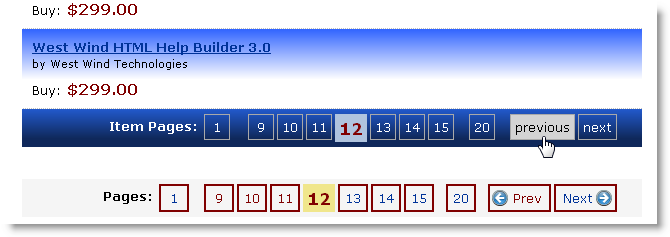
| Pager |
The Pager class provides a standalone pager that can be added on any page and doesn't require a DataSource or related control. The control can be manually assigned values to display or automatically infer values using one of the FilterXXX methods to filter a data source.
< > > |
| PreservedProperty |
An individual Preserved Property. Contains a ControlId and Property name and optional (on preserve) an instance of a control. |
| PreservePropertyControl |
Control used to automatically preserve properties on a page. By calling PreserveProperty you're instructing this control to persist and then restore the value of the specified property or field of a control and have it automatically restored on the next page access. The difference of this mechanism is that it works with ViewState off, and automatically reassigns persisted values back to the controls they belong to without any extra code. It |
| RequiredFieldException |
Exception thrown when a required field is not filled in. Used internally for catching these errors and rendering the error. |
| ScriptContainer |
that provides script embedding functionality to ASP.NET pages. Features include the ability to use ResolveUrl style src urls to place script includes inline (to the control), in the Header or using standard ASP.NET ClientScript or ScriptManager. The control can also optimize scripts if a .min.js script file is available by using the AllowMinScript property on the script. The purpose of this control is to provide Intellisense |
| ScriptItem |
Individual Script Item used inside of a script container. This control maps syntax of the standard HTML script tag and ads a number of additional properties that are specific to script generation. Note there's no Intellisense on this child item as it is rendered as an HtmlGenericControl and parsed into this object. Hence the properties below must be manually typed in and are not visible to Intellisense. |
| TabCollection |
|
| TabControl |
The TabControl provides a simple client control tab interface to display multiple pages with a tabbed interface at the top. Content pages are simply created as plain |
| TabPage |
The individual TabPage class that holds the intermediary Tab page values |
| ValidationErrorException |
An exception fired if a validation error occurs in DataBinding |
 delDataBindingItemValidate delDataBindingItemValidate |
|
| delItemNotification |
|
| delItemResultNotification |
|
 AjaxMethodCallbackServiceTypes AjaxMethodCallbackServiceTypes |
Determines what kind of client proxy is created for you |
| BindingErrorMessageLocations |
for the various binding error message locations possible that determine where the error messages are rendered in relation to the control. |
| BindingModes |
Determines how databinding is performed for the target control. Note that if a DataBindingItem is marked for None or OneWay, the control will not be unbound or in the case of None bound even when an explicit call to DataBind() or Unbind() is made. |
| CallbackProcessingModes |
Determines when page level callbacks are processed |
| DatePickerDisplayModes |
|
| ErrorDisplayTypes |
|
| HelpControlTypes |
Determines whether link is treated as a link or as a page F1 handler. |
| HoverEventHandlerModes |
|
| PropertyStorageModes |
Determines how preserved properties are stored on the page |
| RenderModes |
|
 IDataBinder IDataBinder |
Extender style interface that allows adding a DataBinder object to a control and interact with a DataBinder object on a Page. Any control marked with this interface can be automatically pulled into the a DataBinder instance with DataBinder.LoadFromControls(). |

Comment or report problem with topic