 showStatus
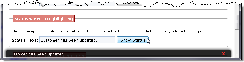
Global function that displays a status bar at the bottom of a Web page. The status bar can slide up from the bottom and slide down after a specified timeout to get out of the way. Alternately the statusbar can display in 'highlighted' mode and then revert to a less distinctive view or revert back to a fixed 'afterTimeoutText' message.
The status bar can be formatted with CSS styling and the options allow configuring exactly which CSS classes are used.
Operation
The statusbar can be used without any configuration simply by calling the above function at any time. The function will create the required <div> and add it to the document the first time the function is called.showStatus("Getting more data...");Alternately you can configure the statusbar display once per page typically in $(document).ready():
$(document).ready( function() {
     // one time configuration on page load
<<b>>   showStatus({ afterTimeoutText: "Ready", closable: true });<</b>>});
});

function someClickHandler() {
      // simple use multiple times anywhere in the page
	showStatus("Customer data updated.",4000);
}
CSS Styling
The default styling provided looks like this:.statusbar
{
position: fixed ;
bottom: 0px;
left: 10px;
right: 10px;
height: 16px;
padding: 8px 2px 8px 10px;
font-weight: normal;
background: black;
color: white;
opacity: .80;
filter: alpha(opacity="85");
z-index: 200;
overflow: no-display;
border-radius: 8px 8px 0 0;
box-shadow: -1px -1px 6px 2px #535353;
}
.statusbarhighlight
{
font-weight: bold;
color: cornsilk;
background: maroon;
}
.statusbarclose
{
position: absolute;
right: 1px;
top: 1px;
color:red;
font-size: 8pt;
font-weight: bold;
opacity: 0.80;
cursor: pointer;
width: 28px;
height: 28px;
background-image: url(images/closex.png);
background-repeat: no-repeat;
}
.statusbarclose:hover
{
opacity: 1;
}
showStatus(message, timeout, isHighlighted, additive)
Parameters
message
The text to be displayed on the statusbar.
Alternately you can pass in an StatusBar options map that configures the status bar. (see options in Notes)
'hide' is a special value to hides the status bar.
timeout
Timeout for how long the text specified is displayed before hiding, reverting to the afterTimeoutText or going from highlighted to normal view.
isHighlighted
Determines if the status bar is displayed in the highlighted style. The default merely style uses bold and colored text.
additive
Determines if the status bar messages are additive. Where the message is appended depends on the prependMultiline setting in the StatusBar definition - top or bottom.
Remarks
StatusBar Options
The following options and their default values are available:
opt = { elementId: "_showstatus",
     // display a close button on upper right corner
	closable: false,
      // Optional text displayed after timeout is up
	afterTimeoutText: null,
      // if true status bar hides after timeout is up
	autoClose: false,
      // you can turn off all effects and just show the status bar
	noEffects: false,
      // speed for animation effect
      effectSpeed: null,
      // css class for main status bar display
	cssClass: "statusbar",
      // css class for highlighted status bar display
	highlightClass: "statusbarhighlight",
      // css class for close button
	closeButtonClass: "statusbarclose",
     // allow multiple lines cumulative display
     additive: false,
     // add multiple line to the top if true
	prependMultiline: true
}
Statusbar Configuration
The showStatus function works based on default settings and requires no special configuration by default. Just call the showStatus() function and it will create a default status bar and work with the default settings. Default styles are provided in westwind.css.
If you want to configure the operation of the status bar you can do so by calling showStatus() and passing a configuration object with the values to override. Configuration typically should occur only once per page:
$(document).ready( function() {
    showStatus( { afterTimeoutText: "Ready", closable: true} );
});
CSS Styling
Default styling is provided in the westwind.css stylesheet.
.statusbar
{
	position: fixed;
	bottom: 0px;
	left: 10px;
	right: 10px;
	height: 16px;
	padding: 5px 2px 5px 10px;
	background: black;
	color: white;
	opacity: .85;
	filter: alpha(opacity="85");
	z-index: 200;
	overflow: hidden;
	overflow-y: auto;
    border-radius: 8px 8px 0 0;
    box-shadow: -1px -1px 6px 2px #535353;
}
.statusbarhighlight
{
	font-weight: bold;
	color: yellow;
}
.statusbarclose
{
	position: absolute;
	right: 20px;
	top: 2px;
	color:red;
	font-size: 8pt;
	font-weight: bold;
	cursor: pointer;
}
See also:
Class global
Comment or report problem with topic